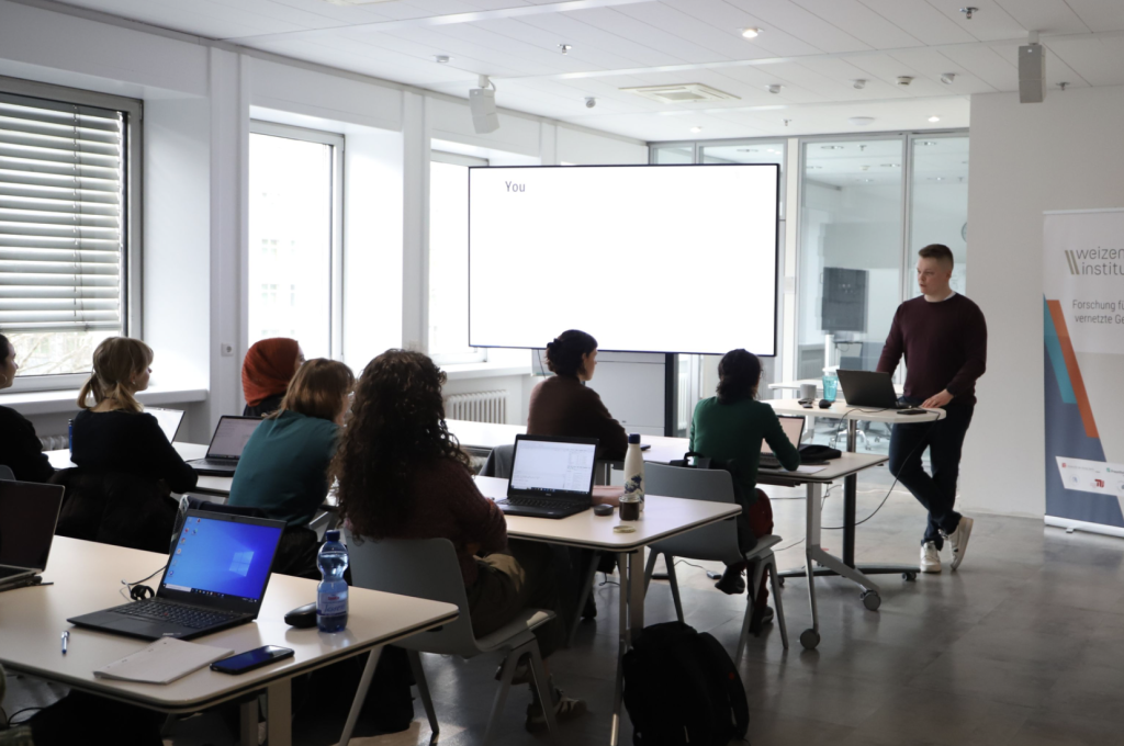
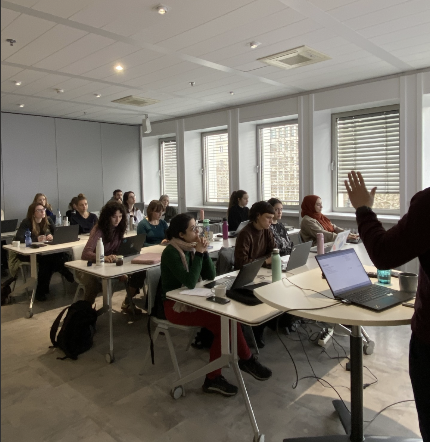
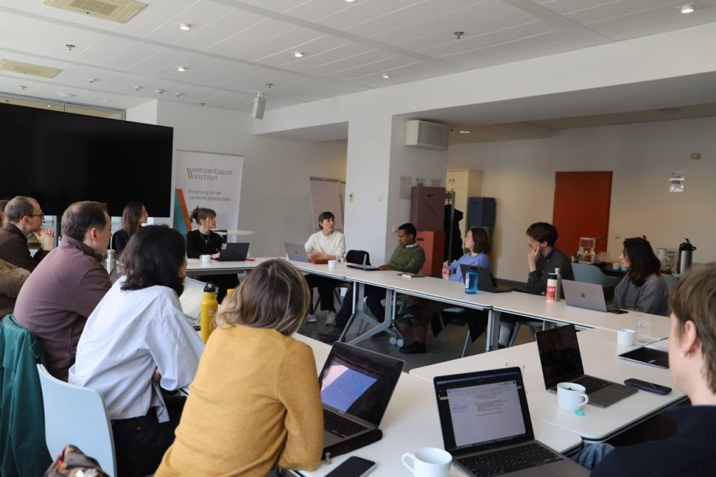
On March 19th, PhD researchers and postdocs from the WI, together with colleagues from partner institutions including DeZIM, FU Berlin, and WBZ, participated in a hands-on workshop on qualitative interviews as a method of data collection. With participants at different stages of their academic careers, the workshop offered a lively and collaborative space to reflect on both the practical challenges and methodological nuances of interview-based research.
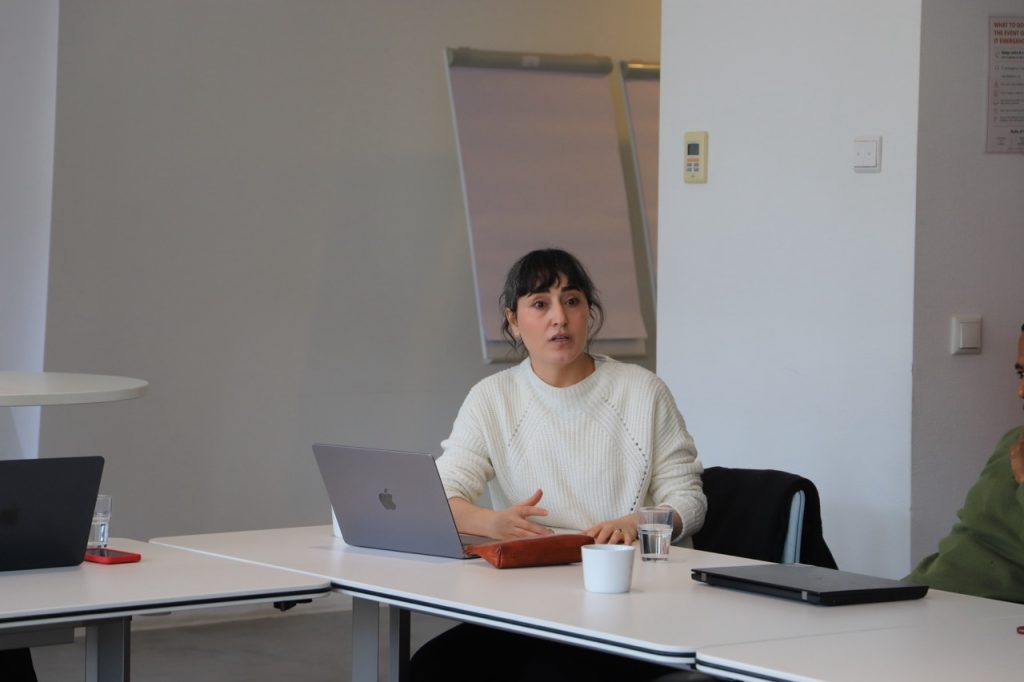
The session began with short inputs from Zozan Baran (FU Berlin), Samuel Zewdie Hagos (DeZIM), and Georg von Richthofen (HIIG). Drawing on their own research experiences, they shared insights into what makes qualitative interviews both rewarding and demanding. Meaningful interviews are not only about asking the “right” questions, but also about building trust, remaining reflexive, and approaching the research process with care and attentiveness.
A recurring theme throughout the workshop was positionality: how researchers are perceived, how they position themselves, and how this shapes the interview situation. While shared language or similar backgrounds can help establish rapport, the speakers emphasized that these factors do not erase existing asymmetries. Instead, they highlighted the importance of continuously reflecting on expectations, power dynamics, and vulnerabilities on all sides of the interaction.
This kind of reflection, participants noted, starts well before entering the field. Engaging deeply with theory and existing literature was framed as essential preparation – captured in the idea of approaching interviews with “an open mind, but not an empty head.”
Beyond interview design, the workshop also explored the broader conditions under which interviews take place. Discussions addressed practical considerations such as the choice of setting (online vs. in person) and how each shapes the interaction. Ethical questions also played a central role, particularly when working with sensitive or potentially traumatic topics.
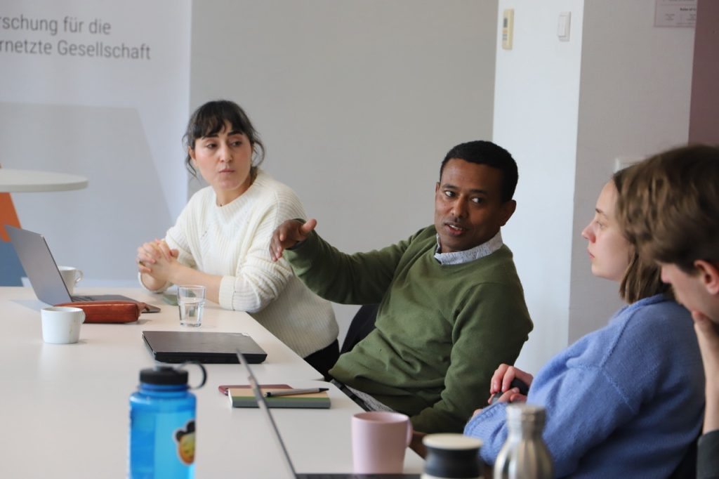
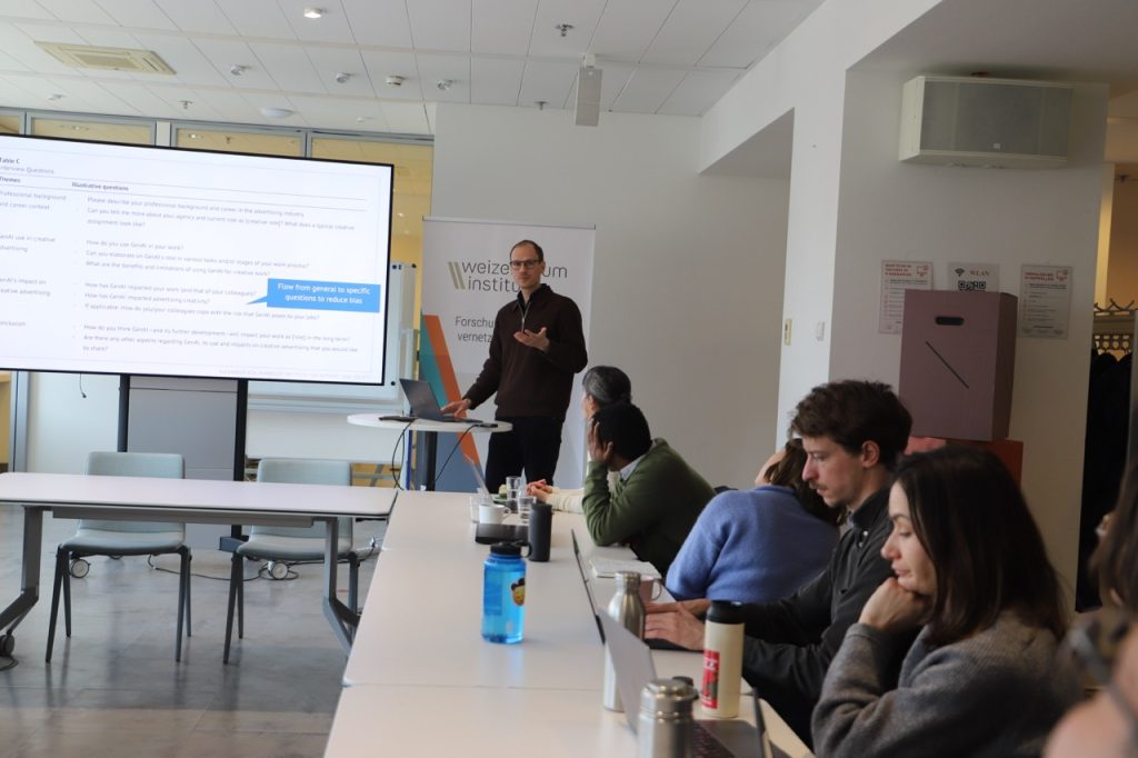
In the moderated discussion that followed, participants connected these themes to their own research projects. Conversations around locality, navigating difficult situations, and managing the emotional demands of working with vulnerable groups led to a rich exchange of perspectives and strategies.
Rather than offering a fixed set of rules, the workshop highlighted the iterative nature of qualitative interviewing: analyze, adapt, and refine.